Stanford
How I crafted Stanford’s UI Kit and initiated their first design system.
2023
UI Design, Design Systems, Accessibility
For almost two years, I worked with Stanford as a Senior UX/UI Designer in a staff augmentation capacity. I built their design system in Figma and made recommendations for improvements in efficiency and simplicity.
My Role
Senior UX/UI Designer
My Work
Accessibility Audits
Figma Component Library
Design System Streamlining
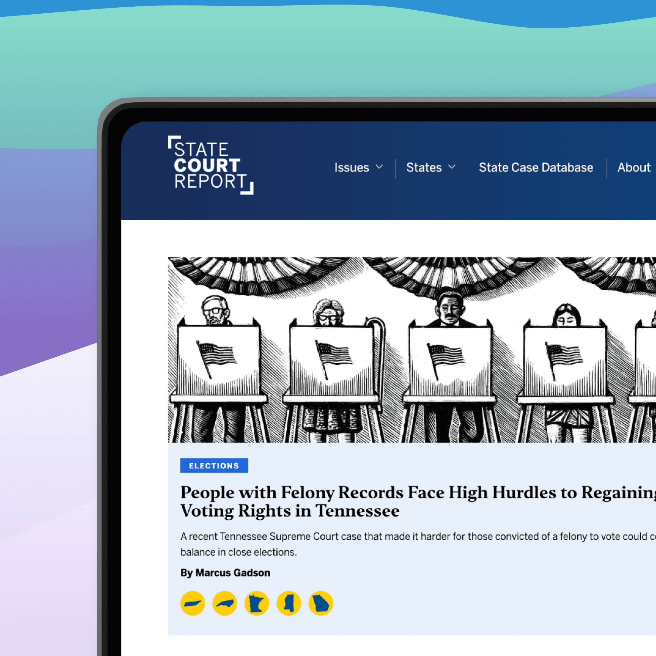
How might we empower Stanford to swiftly iterate on site designs?

The Why
Stanford would design a new file from scratch every time a department requested a site
They needed a system to reduce project times and iterate with the departments for quicker feedback cycles.
The What
Streamlined Stanford's design process in Figma with a comprehensive UI Kit containing reusable components and styles.
Enabled quick access to design elements across projects using Figma Libraries.
Empowered the team to quickly experiment with diverse design variations.

Highlight
The Why
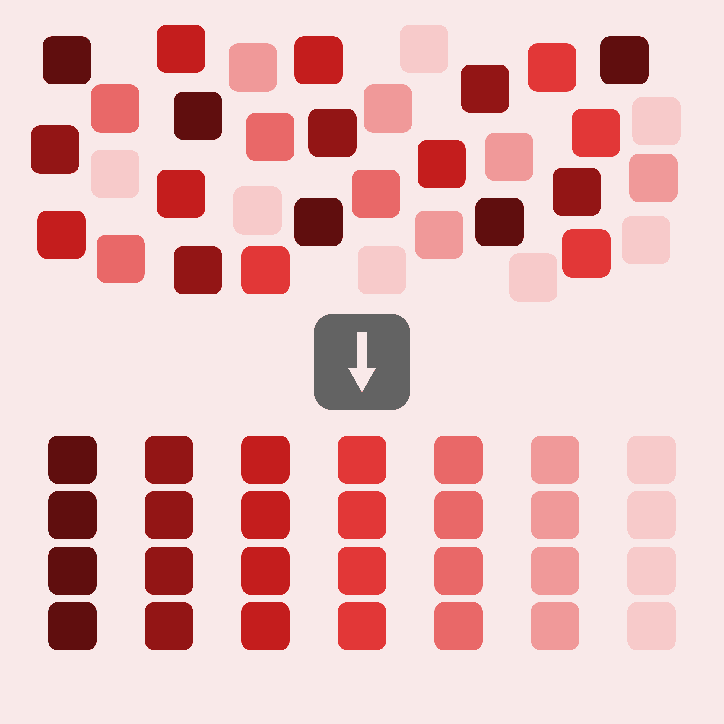
Stanford's components and site designs used more than 120 different color styles, innumerable text overrides, and inconsistent spacing sizes.
They needed to simplify and unify their system by establishing globally implemented design tokens.
The What
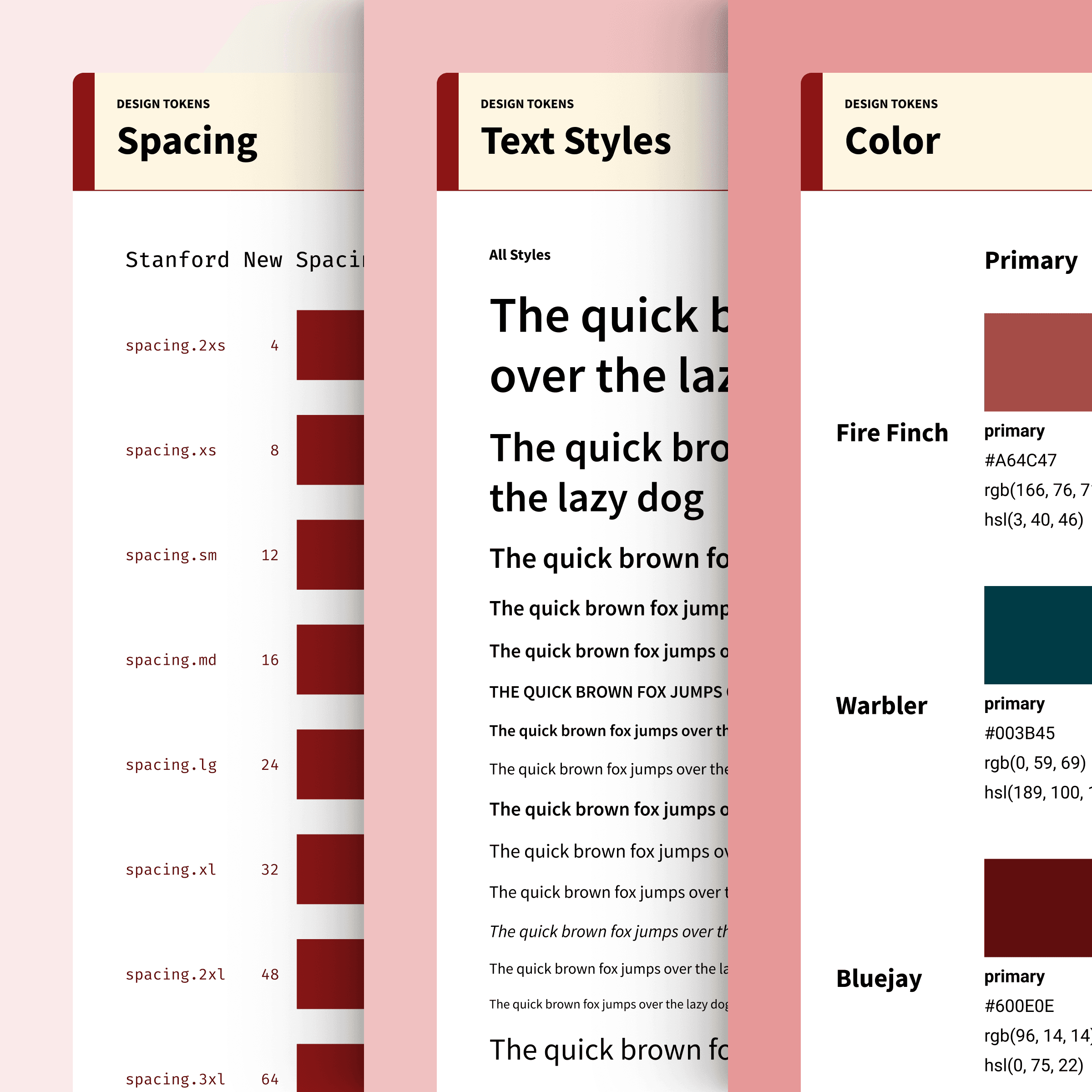
Analyzed the current state of their internal design system, identifying key areas for improvements.
Established a clear path for implementing design tokens in a non-disruptive way.
Implemented 9 categories of design tokens (231 tokens in total) for a more efficient design process.
Takeaways
Some clients shy away from big overhauls to their system and prefer bite-sized chunks to work on a little at a time. Through working with Stanford, I learned the importance of being firm in your expertise and recommendations, but flexible in the method of execution. Allowing us to implement the updates on the client's priorities and timeline built trust, a good rapport, and momentum over time in these efforts.